7 Awful Cliches We See All the Time in Web Hosting

Please bear with me but after working for many years in the hosting industry, I've seen trite cliches that don't make any sense. It's like if standing out from the crowd doesn't interest hosting providers.
I compiled a list of the most common cliches which in my opinion should be avoided at any cost. From images that look as fake as a Rolex you'd buy on a beach to inexplicable selling and advertising strategies.
Bonus tip: WHMCS SEO myths you should avoid.
Cliché Images on Every Hosting Website
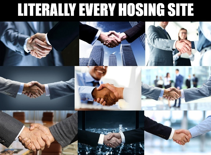
The almighty handshake. As far as the cringe it can be, web hosting providers don't meet customers in person. Customers land on the website, place an order for a hosting plan, register a couple of domains and that's it. But there's a particular type of handshake that gives me anxiety.

Handshakes approaching through the monitor. In so many About Us pages there's this thing in place that is screaming cliches from any angle. If the picture could speak it would say:
«Hey look at me, I'm a business man and handsome too. Look at my suit and the meeting table behind me. We have plans and graphs trending upwards. The data never lies and failure is not an option. Shake my hand. It's a win-win situation»
Speaking of About Us, almost every time this page hosts pictures of datacenters that seem to come from Star Wars movies. Server rooms are astonishing with racks as far as the eye can see. The sad truth is that 99% of the time the picture is fake or tendentious.
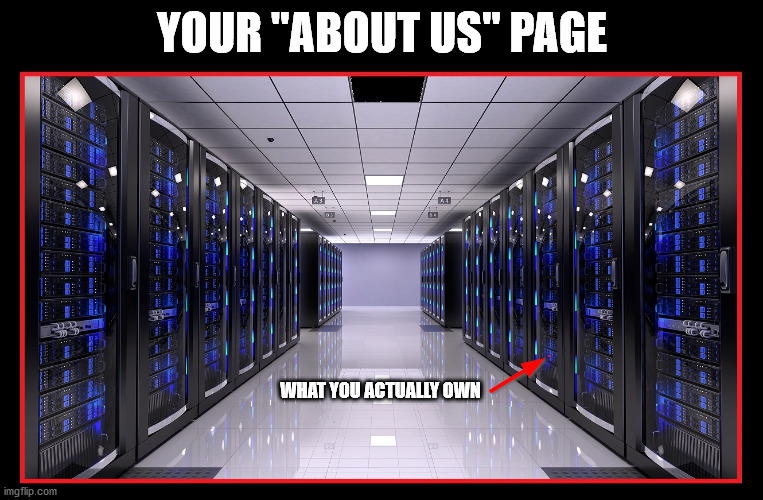
There's this weird habit of making companies look bigger than they actually are. Don't get me wrong, that's fine as long as the bullshit meter doesn't go crazy. If you own a tiny fraction of a 1U server, you can't advertise the entire datacenter as if it were yours.
Ironically, datacenters are usually ugly but we don't see them depicted in this way. Just think about it. If you owned an ugly datacenter, would you share any picture of it? No. That's why the internet "lies" about their look.
Let's take a look at OVH datacenters that owns the world's largest datacenter in surface area. They are also the largest hosting provider in Europe and third in the world. That's pretty big. Feel free to click on the images to enjoy the view of such monsters.
 |
 |
 |
 |
 |
 |
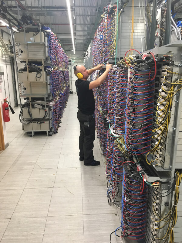
My garage looks prettier. As you can imagine there aren't many picture of the ugly interiors but with a bit of research you can find some terrible views of the inside.
 |
 |
 |
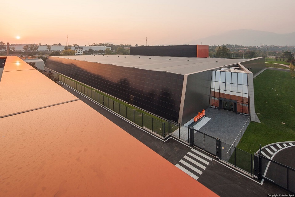
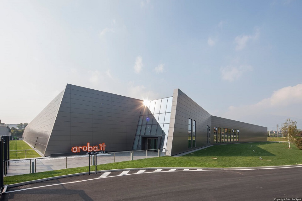
Obviously the look of buildings and server rooms is not a priority for OVH since they still make millions each year. Anyway don't worry, beautiful datacenters exist. Let's have a refreshing look at Aruba ones.
 |
 |
 |
 |
 |
 |
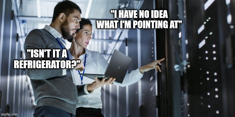
Where there are pictures of server rooms, generally there are also pictures of system administrators that do not reflect the reality.
Cliches also extend to meeting rooms. Once again we have spectacular places with handsome people. Possibly they are dressed as if they are going to attend a wedding party with zen-like concentration.
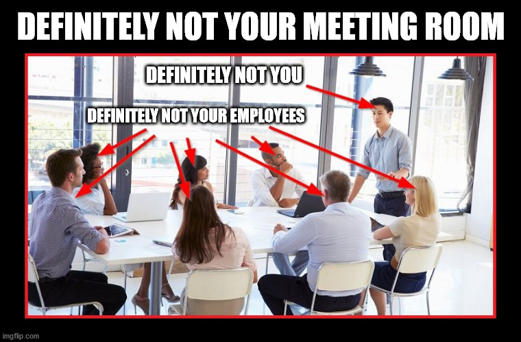
Such images aim to convey teamwork but unless those are the actual people on your team, the image fails to deliver the message. I find such images quite intimidating especially when used for one-man businesses.
No hosting website can be considered complete without the pretty help desk girl. As far as sexist and predictable it can be, it makes the business look fake. Unfortunately, this kind of picture is overly used on thousands of websites.

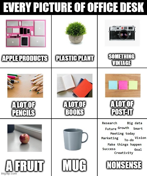
But nothing irritates me more than pictures of keyboards, fingertips and workstations that always include the following items perfectly arranged on the desk:
- As many Apple product as possible to "think out of the box"
- Random books on the table proving knowledge
- Raining pencils for taking notes. The pencil/hand ratio is 15:1
- A sad plastic plant, something made of wood, a fruit and a mug
- Possibly something vintage like an old camera
- Post-it in different colors containing expressions like "Smart", "Success", "Growth" and "To do list: project A, B, C". Look at the wise use of strikethrough
Definetly not staged.
I want to conclude this chapter with other various generic and clichè images still used a lot in today's web hosting websites. There's nothing wrong in using them but it is starting to get boring.

Giving Customers Too Many Choices
Every website owner puts in a lot of efforts, tactics and money to attract visitors. Once they land on the website, converting them into customers is a whole different story.
The process of customer acquisition can be broken up into a variety of different strategies both free and paid. SEO and content marketing. Social media, advertising, pre-sales support, analytics and a website that offers a great user-experience.
That's a lot of work then I see providers undermining their efforts making a silly mistake: overchoice.
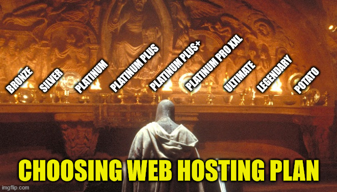
Having more choices appears to be appealing initially but it can make decisions more difficult. This translates into visitors not purchasing any service. If you don't want to lose sales, don't offer more than 4 options.
When it comes to web hosting, there's another interesting reason why you should keep a limited number of plans. Very rarely customers need to upgrade to a higher plan.
Nowadays the difference between starter and advanced plans is all about disk space and number of emails, databases and FTP accounts. Resources demand doesn't change overnight. The average user will simply stick to the plan that fits his website.
Moreover the more options you offer, the less you earn. Offering 1 GB, 5GB and 20GB generates more profit than 1 GB, 2 GB, 5 GB, 10 GB, 15 GB and 20 GB. That's because in the former case there is a marked difference in price between one plan and another so profit margins are higher.
SSL Certificates
Here is another area where customers are overwelmed with too many choices. There are several SSL certificate authorities, brands and SSL certificates to choose from. In the table below I'm focusing on the most popular.
| Authority | Description | |||||
|---|---|---|---|---|---|---|
| IdenTrust firmly controls the global market of SSL certificates. One out of two certificates is powered by them. | ||||||
 |
DigiCert comes seconds but they operate with several brands: Symantec (Norton), GeoTrust, RapidSSL, Thawte and Verisgn.
|
|||||
| Comodo is third and is rebranding Sectigo. |
Things get a bit more complicated as there are three different types of SSL certificates.
| SSL Type | Description |
|---|---|
| Single |
Secures one FQDM (Fully Qualified Domain Name) or subdomain. Bear in mind that example.com and www.example.com count as two different domain names. On paper one should buy two certificates to secure both but usually authorities will give you a "free pass" for "www":
p.s. You shouldn't let visitors browse websites with or without "www" as this causes duplicate content. |
| Wildcard |
Secures one domain name and an unlimited number of its subdomains:
|
| Multi-domain |
Secures multiple domain names:
|
Lastly we have the level of validation.
| Validation | Description |
|---|---|
| DV Domain Validation |
The cheapest option that covers basic verification of the ownership of the domain. Instant activation. |
| OV Organization Validation |
In addition to verification of the ownership of the domain, certain details of the owner are authenticated. Activation can take a few hours or days to complete. |
| EV Extended Validation |
This is the most expensive solution. Like DV and OV it offers validation and authentication of ownership but also the physical existence of your business. Activation takes a few days to several weeks. Depending on browsers, address bar becomes green or blue and shows your business name and address on click. |
There are also extra features like timestamp on the SSL seal but nowadays now one uses them on websites. Certificates also vary depending on warranties that start from 10.000 $ and go up to 2.000.000 $. In essence in the event something goes wrong on authority end, you're covered.
This was just the tip of the iceberg. Even providers ignore most of the things around SSL certificates and so they end up selling tens of them. The idea at the base is that you can't go wrong if you sell every possible option.
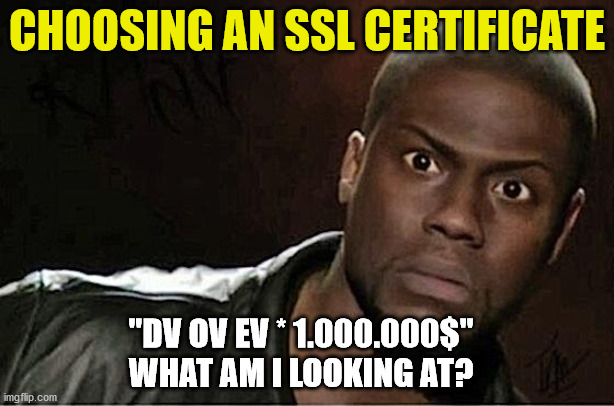
Customers often look for single, wildcard, DV and EV certificates. Do yourself a favor and pick one certificate for every option. This will make life easier for both you and customers.
Selling Hosting With SEO
If you are reading this article is very likely that you are in the hosting industry or you are considering the idea of starting a hosting business. In both cases, you know that cross-selling is very common in this market.
Generally speaking, a web hosting package requires a domain name and eventually services like SSL certificates. This scenario is perfect for cross selling strategies but some companies go too far selling fluff. That's the case of SEO.
Some providers give the possibility to buy search engine optimization service for websites they host. The problem is that most of the times they don't know what is SEO. This service is expensive (150-500 euro / year) and provides litte or no benefits to end-users.
In the table below I list the most common features included in the price of such services describing what they actually are and their effective value.
| Feature | Description | Commercial value |
|---|---|---|
| SEO Audit |
A software scans the website looking for technical and SEO mistakes. It looks for things like loading speed, internal linking, broken links, crawability, meta tags, duplicate content and tens of other metrics. When the check completes, the website receives a SEO Health Score on a 100-point scale. Anyone can get a professional audit for free from any of the following services: Personally I use the first two websites in the list. |
Free |
| Local SEO |
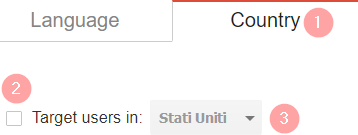
This option should be used only for geographic data. A good example is for a restaurant website. If the restaurant is in Italy, it is probably not of interest to people in Japan. On the other hand if the website is for users in different locations, it's better not to use this tool. Settings can be changed from Google Search Console via International Targeting. Proceed to set the default country for users. That's it. |
Free |
| Competitor Analysis |
Once again neilpatel.com and ahrefs.com allows to monitor competitors for free. |
Free |
| Reports & statistics |
Guess what? neilpatel.com, ahrefs.com, semrush.com. |
Free |
| Sitemap |
Nothing that a CMS can't do. |
Free |
| Keyword monitoring |
This time there's nothing free. The cheapest option in the market is neilpatel.com. It costs 29 euro / months and allows to track up to 3 websites (100 keywords each) offering extra features:
As a reference, providers usually offer coverage for only 1 website and 20-30 keywords. Having said that, monitoring keywords is not everyone. Inexperienced users will likely don't unserstand the purpose of this tool. |
29 euro / month |
Frankly I don't see why one should pay 150-500 euro / year to providers for services of inferior value that ara available in the market free of charge or cheaper.
As if it wasn't enough, using these tools without doing SEO is useless. It would be like paying for gym membership but never go to the gym and expecting results.
In conclusion, I still have to see a provider that sells a real SEO service that is worth the asking price. However, despite all, such services still sell well because end-users don't know anything about SEO. Basically they're like fish in a barrel.
Hosting Fake Reviews
I'm not a big fan of reviews and 5-star rating systems as they attract the extremes (users with either very bad or very good experiences). Going further, some users are more generous while some others very demanding. At the end of the day users who had average experiences (usually the vast majority) are missing in the calculation.
Having said that, with hosting providers we have another peculiar problem. On their websites they are very proone to host fake reviews and untruthful feedback that come from friends or that have been exchanged for discounts.
In my opinion this is something that should be avoided as fake reviews are meaningless to potential customers.
I can't stand them to the point that in our website I decided to put a fake and sarcastic review. If you are asking yourself who is the man in the picture, it's Dwayne Johnson (The Rock) combined with Neil Patrick Harris using FantaMorph and PhotoShop.
Navbar in WHMCS
If you are a hosting provider, you can't not know what is WHMCS. It's the best control panel to manage a hosting company.
Many web developers and web designers are actively extending this software releasing third-party solutions but when it comes to templates, I'm seeing double.
I'm not drunk. It's just that many templates have the tendency to overlook user-experience. Web designers focus on creating nice looking pages but then force customers to use two navbars.
The first navbar is used for the typical pages you would expect from any website (Home, Services, About Us, Contact Us) but there's a second one right below. I'm talking about WHMCS navigation bar (Home, Store, Announcements, Knowledgebase).
Having two navbars kills user-experience. If you add that WHMCS navbar changes depending on if you are logged in or logged out of the website things get even more confusing. With a bit of effort one can combine them in a single navbar like we did in our site.
Competitive Advertising
Creating contrasts with services offered by competitors can be a good advertising strategy for a new brand to break into markets but one should make it without exaggerating.
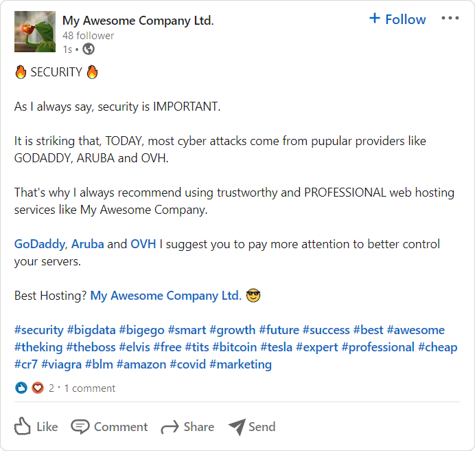
Every once in a while, I see small and medium-sized providers mocking bigger competitors on social media. The target is usually the biggest fish in the country. It's GoDaddy for United States, Aruba for Italy and OVH for Europe in general.
The criticism relates above all to two issues: security and support. Here is a typical example of posts I find on LinkedIn. Before you start reading it, keep in mind this post is fake. I created it myself as I don't want to be sued ![]()
Where do I start? First off, I don't really like the "He's bad, I'm good" communication strategy but that's my personal taste. Secondly, I have something to say about the content.
The reason why most cyber attacks come from huge hosting providers is self-explanatory. The more servers and customers you have, the more lamers you get. Such posts makes absolutelly no sense as they are suggesting that big providers are not professional.
It would be like suggesting that WordPress is not secure because thousands of lamers focus on attacking it. The reason why WordPress attracts so many of them, is the very fact that it is the most used CMS in the world. What would be the point of cracking a software that no one uses?
Another topic where "He's bad, I'm good" posts flourish, is customer support. Some small providers claim their support is better than the one offered by big ones. That's pretty logical when one has a microscopic fraction of GoDaddy user-base.
Ironically when such small providers get bigger, they start ignoring customers, unknowingly host malicious scripts. But as long as it is not happening yet, they can keep claiming they are more professional.




This article is a bit funny and looks like it is specially made for my company.
I have two nav-bars, server images, hand shack. xd.
Anyway, It was so funny to read. I got an opportunity to smile in such a pandemic situation. lol.